Connecting With Color
Have you ever walked into an office or room and instantly felt a sense of gloom and overall …blah? If you think about that place - what color was it? My guess is that there were not brightly colored yellow walls or powder blue cubicles adorning the floor. There probably were not healthy and lively flowers or eye catching pictures accenting the walls and tables. It probably wasn't colorful.

Written by Anna Gloth
Color can instantly evoke emotions in a viewer. And as such, it is an important design aspect in all visual communication. The right color choices can support or detract from the key message of a piece and should be carefully and purposefully selected and used across print, video and web media.
Media
Depending on whether a design is for print, web, or video, color is created and will appear differently. When color is shown on a computer monitor, it uses RGB colorspace. RGB stands for Red, Green, Blue, and by mixing the projected light of these three colors together, we can create a wide range of colors in the spectrum perceived by the human eye. The RGB colorspace is ‘additive’ because when more light is used on the screen the image becomes brighter.
CMYK colorspace is used for print pieces. CMYK stands for Cyan, Magenta, Yellow, blacK. Ink mistures of these individual colors are combined to create other colors. This colorspace is ‘subtractive’ because as more ink is used on the paper, the less light can be reflected back to a viewer’s eye, which makes the image darker. The CMYK colorspace does not appear as bright as RGB because it uses ink instead of colored light. Ink is also limiting because it cannot show as large a range of color as light.
Because print and screen colors are created and perceived differently - light projection vs. light reflection – you cannot simply ‘copy’ a color from one media to the other. Brand and campaign colors that cross media platforms should be visually analyzed to ensure they convey the appropriate visual meaning in each independent presentation case. 
Audience & Emotion
Red, orange, and yellow are classified as warm colors. In nature they are associated with the summer season, heat, the rising and setting of the sun, and they are . Warm colors are usually considered energizing, passionate, and exciting.
The cool colors are green, blue, and purple. Cool colors are naturally seen in bodies of water, forest foliage, and darkness. Cool colors are found to be very mellow and tranquil. These colors appear professional and relaxing. Blue, for example, predominates the color palettes of healthcare related organizations and products.
Viewing some colors is proven to physiologically affect the body, which influences emotions. Warmer colors, especially red, can raise a person's blood pressure and stimulate the brain, which may be why they are considered passionate, exciting colors. For the most part, the reason people tie certain emotions to certain colors seems psychological. People's feelings about color can mimic how they appear in nature. Yellow may be seen as energizing because the yellow sun provides energy. People see these connections and associate the relevant emotions to the colors.
People also make interesting psychological observations about dark and light colors. The reason darker colors are seen as serious and professional is because people perceive them to be heavier, more solid colors. Bright colors considered more carefree and fun because they are thought to be lightweight.
Everyone perceives color differently. History, nationality, religion and gender can all affect how a person feels about color. Colors can have different associations and historical context in each country. Religious ceremonies also can tie spiritual meanings to each color. There is even evidence suggesting that there are subtle differences in color that men cannot perceive as well as women. These factors and many others contribute to why each color has so many different connotations.
The color yellow, for example, is considered to be bright and energizing, but it also represents cowardly behavior (yellow-bellied). When yellow is used on street signs, it is a warning to be cautious. In Egypt, yellow is the color of mourning. Buddhist monks wear yellow robes because to them it is associated with humility. At a first glance, the color yellow already has several connotations based on different audiences, and many of them are contradictory.
When making color decisions, it is important to determine the target audience in order to convey the right message. Color decisions can influence both direct messages and secondary brand values and attributes in any communication. Color should be carefully selected to align with the key message and emotions being conveyed in a piece.
Color Family & Palette
When producing a communication piece, several colors are going to be needed and those colors need to work together as a team to communicate a unified message and feeling. A Brand or campaign needs to have a specific color scheme to be effective.
To create a harmonious and effective color scheme, a solid understanding of the color wheel is imperative
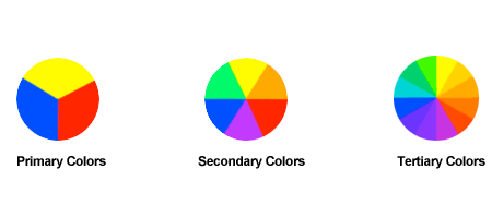
This standard color wheel is made from the three primary colors: red, blue, and yellow. From combinations of these hues, all of the other colors are created. By mixing two of the primary colors together, a secondary color is created. The secondary colors are green, orange, and purple. When a primary color and a secondary color are combined, a tertiary color is created. These colors are yellow-orange, red-orange, red-purple, blue-purple, blue-green, and yellow-green.

Understanding the color wheel, allows us to understand color harmony. There are several formulas for basic color harmonies, which are colors that work well together, regardless of the colorspace being used.
Two simple ways to create a pleasing color scheme are to look at the analogous and complementary colors. An analogous color scheme is made up of three colors that are side by side on the color wheel. For example, on a 12 color color-wheel, red, red-orange, and red-purple are analogous colors. A complementary color is the color on the opposite side of the color wheel. If purple was the base color, its complement would be green.
Analogous and complementary colors are a good starting point, but additional colors and adjustments will be needed for a good color scheme. If complementary colors are used in their purest form, they can be too intense and appear to vibrate. Color vibration is harsh on the eyes and can be distracting to the viewer. Understanding color harmony and color design theory is imperative in developing an effective communication piece. Below are examples of similar colors used incorrectly and corectly together.
In the left column, the complementary colors are of the same value, and this is causing them to
vibrate. In the right column, they have been altered to stop the vibration resulting in a much better use case.

There are several tools out there that will help you create appealing color schemes. Adobe's Kuler is a great, free resource to get you started with creating color schemes and finding color inspiration. It will also create color schemes for you based on complementary and analogous colors. After creating a color scheme, Kuler allows you to save and import the color scheme into Adobe programs.
By researching color and using it correctly, you can more effectively communicate to an audience. Appropriate colors help create an attractive identity, lend value to campaigns or brands and help avoid that feeling of ...blah.


