Door to the New World
Inspiration can be found anywhere - from the websites we depend on everyday to world-class museums on the other side of the world. As a designer, every experience has the potential to become the origin point of a creative design solution for a client project here at Lyquix. While some of this design inspiration is easily accessible, I’ve found that sometimes the best insight comes out of just a little bit of adventuring.
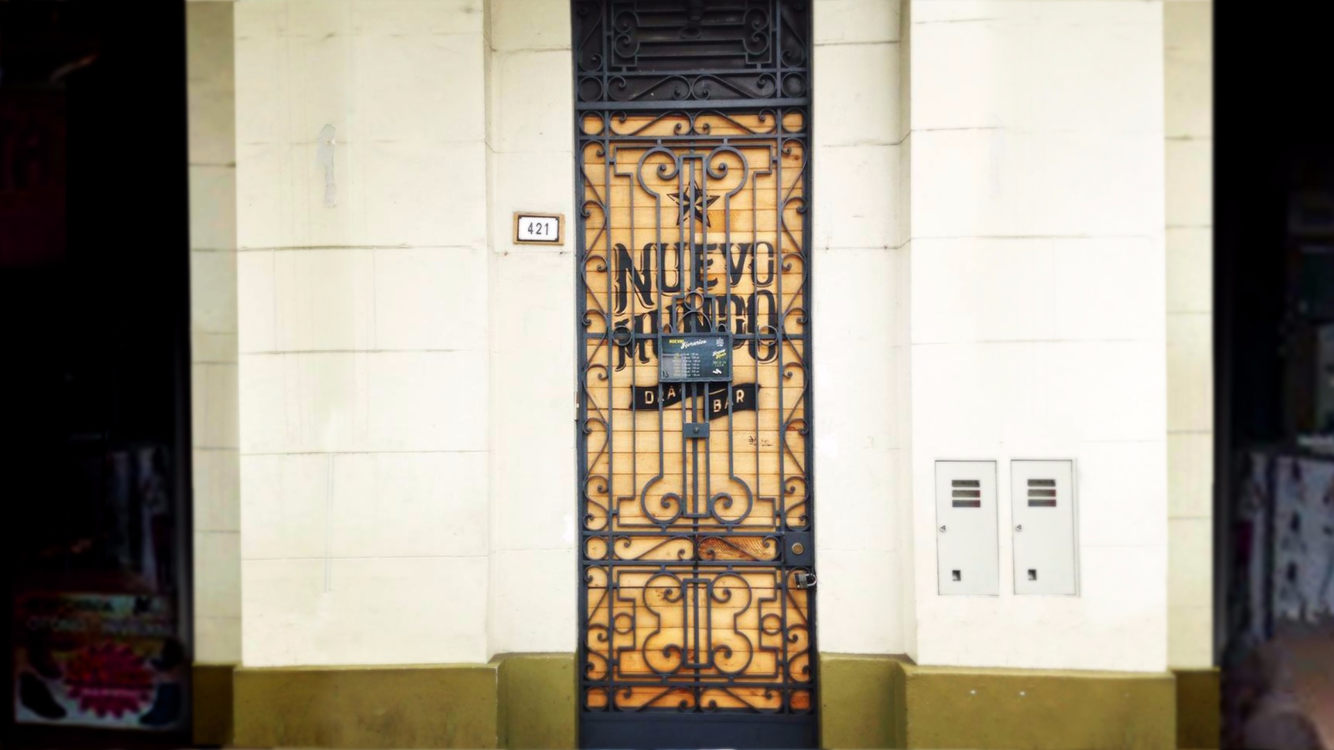
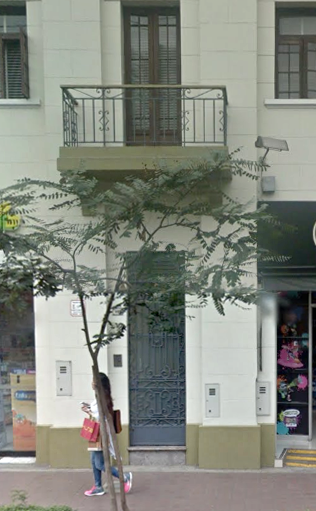
An intriguing doorway lurks under a balcony along the Av. Jose Larco in the heart of the Miraflores neighborhood in Lima, Peru. Its tall and narrow frame sits sandwiched in between two commonplace budget boutiques. Walking down the street, it would be an easy thing for a passerby to overlook. I almost missed it myself attempting to keep up with my local tour guide, Saul, but I had just enough time to snap a quick picture.
This elaborate gateway opens up to a brewery aptly named Nuevo Mundo, or New World - I’ll get into why I am fascinated with this signage/brand design in a minute. However, before I get too far ahead of myself I want to give you some perspective. I’ve included a wide-angle view of the street.
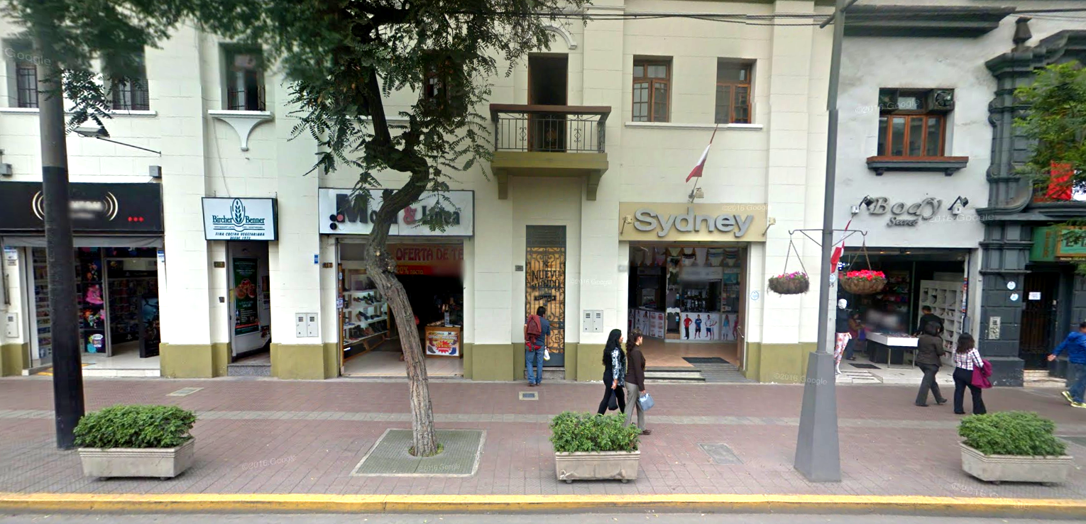
This is a fairly sufficient representation of the rest of the street: Oversized type sitting in clunky rectangular signs, hanging over overwhelmed doorways. You notice right away that the Nuevo Mundo door design is doing something very visually different. In a line of signage that seems to be shouting at pedestrians, Nuevo Mundo’s isn’t, and this makes it stand out.
Here’s where I want to bring up the name of this bar again - Nuevo Mundo, or New World. The way the design of this door parallels the idea of it being the entrance to a bar called “New World” is just genius. With a couple small, but strong design choices this isn’t just a door. It’s a mysterious portal to a different world, separate from (and yet totally rooted in) the environment around it.
We’ve already established that this door is not visually associating itself with the style of the business signage around it. What it is visually playing off of is the design of the original building. All of the branded elements for the bar sit behind the buildings original wrought iron gate. None of the branding extends outside of that area. There are no overhead signs or wall paint. Most of the entry way for the bar is basically just the original architecture of the building. Not only that, even the choice for the material of the door matches the building. It’s made of wood. There’s a parallel happening here, the window panes and balconies above the shop use wood and wrought iron and so does the entryway to the Nuevo Mundo.
Example of the original state of the door from other side of building.
However, rather than the look of the older, stain-colored wood used in the rest of the building’s window panes and balcony railings, the Nuevo Mundo door itself is made of a raw yellowed wood, suggesting that unlike the rest of the building, this is door is new. This creates a rather mysterious effect. This door looks like it could have been a part of the original building, except that it hasn’t aged, which gives it a kind of magical quality. Not unlike the Wardrobe in Narnia, it’s as though the door has been sitting there forever, without aging, ready to transport anyone brave enough to walk through it to a another world.
So while the other businesses on the street compete to see which who can have the biggest, clunkiest, most “eye-catching!” sign, Nuevo Mundo’s modest door creates a visceral appeal by using the natural design of the building and making smart design choices to immediately create brand identity and user interest that lasts much longer.
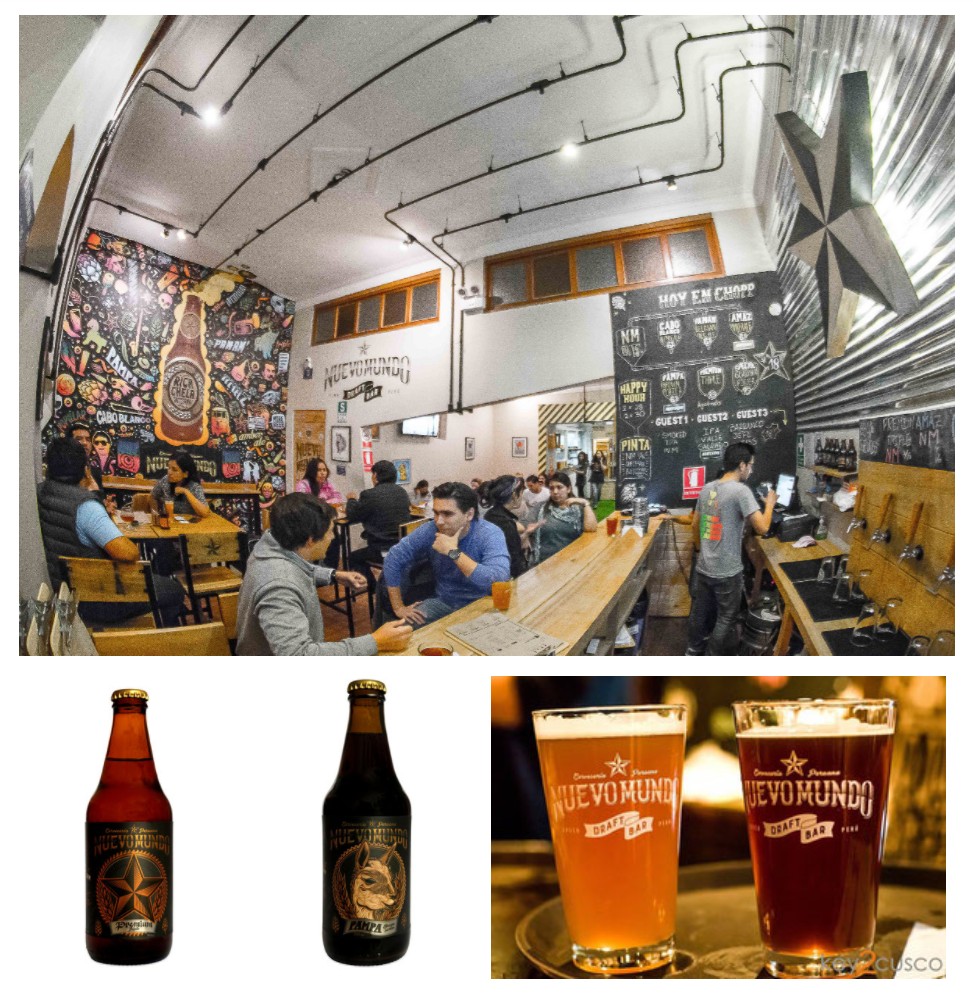
It is also important to note that this door is merely one of the many purposeful elements in the full branding system that Nuevo Mundo uses in both of their locations, in all of their interior spaces and in all of their beer packaging. As for the review of the product itself? I unfortunately never got the chance - the logistics of traversing three cities in ten days with a group of two-dozen 20-somethings would deserve an article all on it’s own.
